
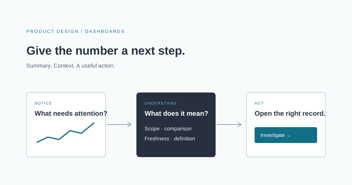
A dashboard can contain accurate numbers and still leave someone unsure what to do. Revenue is up. A queue is growing. A chart has turned orange. Without context, those signals create another task: find out what the screen actually means.
For a team commissioning a dashboard, a useful starting point is the decision it should support. What should a manager notice before the morning meeting? Which customer accounts need attention? What should an operator investigate before work falls behind? The answers determine what belongs on the screen.
Give each dashboard a specific audience
An executive overview and an operations console serve different purposes. The first might summarize a trend worth discussing. The second may need to identify a particular record and give someone a way to act on it. Combining every audience into one dashboard can make both experiences harder to use.
Choose a primary reader and write a short list of questions they need answered. For an illustrative service team, those might be: which requests are approaching a deadline, which are waiting on a customer, and which need a different owner? These questions suggest a useful order for the screen. They also expose metrics that add decoration without helping that reader.
Microsoft's dashboard design guidance similarly recommends considering the audience, prioritizing important information, and providing context for visualizations. Those principles apply to a custom application as well as a reporting tool.
Explain the number before decorating it
A total becomes useful when its meaning is clear. Name the unit, time period, included records, and comparison. “Open requests” and “Requests created this month” are different measures, even when their values happen to match.
Keep definitions available beside the metric or through a short explanation. If a target is shown, identify who set it and when it applies. If there is no agreed target, do not invent one simply to produce a green or red indicator.
For every proposed metric, ask:
- What exactly is being counted or calculated?
- What is included, excluded, or missing?
- Which comparison helps the reader judge it?
- What decision could change after seeing it?
Agree on these definitions with the people responsible for the underlying data. A polished chart cannot resolve competing definitions of a customer, a completed job, or an overdue item.
Connect summaries to the records behind them
When a summary indicates a problem, the next step should be available. A queue total can open a filtered list. A delayed-order measure can lead to the relevant orders and their current owners. A trend can link to a report with the same date range and scope.
Preserve context during that transition. If someone selected one region or reporting period, carry that selection forward and show it clearly. A detail page that silently resets the filters makes the dashboard difficult to verify.
Some readers only need to observe. Others can update a record or assign work. Design the next step around their actual permissions rather than putting an action button on every tile.
Treat freshness and missing data as visible states
A dashboard may combine records updated at different intervals. Show when information was refreshed, and explain which sources are delayed. If a source fails, display that state rather than presenting an old value as current.
Distinguish zero from unavailable. No matching orders is a result; an order feed that did not load is a failure to obtain a result. The interface should let the reader recognize that difference without opening a support ticket.
Make the meaning accessible
Use labels, units, and explanatory text alongside visual cues. A chart's important conclusion should be available to someone who cannot perceive its colors or interpret the graphic. The W3C guidance on complex images describes providing text alternatives that convey essential information, including values, relationships, and trends.
A small data table or written summary can also help a reader verify a chart. Avoid adding so many marks and labels that the central comparison disappears. Choose the simplest representation that answers the reader's question.
Validate a decision, not a screenshot
Review the dashboard with realistic tasks: identify an item needing attention, explain why it matters, and reach the relevant detail. Notice where people hesitate or need an explanation from the designer. That is useful evidence for improving the screen.
If your team has plenty of reports but still needs a meeting to understand what requires action, we can help design a focused business application or dashboard. Bring the decisions you need to make and a sample of the data you already have.